After Breast Cancer
Website Redesign
After Breast Cancer (ABC) is a nonprofit that provides support and post-mastectomy essentials to breast cancer survivors. Our website redesign improves accessibility, navigation, and usability, making it easier to find resources, book appointments, and understand ABC’s mission.
Role: UX/UI Designer
Team: 4 members
Timeframe: 3 weeks
Tools: Figma, Canva

Problem
The After Breast Cancer website has unclear navigation, outdated visuals, and a complex user experience, making it challenging for survivors to find resources and for donors to contribute easily.
Solution
The redesigned website features a clear navigation system, a mobile-friendly layout, and an empathetic, user-centered design to improve accessibility, engagement, and donations.
Impact
We aim to boost readability by 20%, cut booking time by 15 seconds, and enhance donor engagement through stories and seamless navigation.

WHY?
We need to create a better user experience to ensure user engagement through their generous donations.
A clear message builds trust and encourages support.
More donations allow the organization to provide essential post-mastectomy support to more survivors.
To help visitors stay longer and explore the organization's mission.
People are more likely to donate when they trust the organization.
Research & Evaluation
-
User Interviews: Conducted three interviews to understand user needs, frustrations, and expectations from the website.
-
Website Annotation: Analyzed the current website, identifying usability issues, unclear navigation, and content gaps.
-
Content Audit: Evaluated the existing site structure, readability, and accessibility to improve information hierarchy and flow.


Users struggled with unclear navigation labels, making it difficult to find essential resources.
Contrast and readability issues impacted accessibility, especially for users with visual impairments.
The website lacked clear messaging about its mission, requiring users to search for important information.
Users preferred a more structured layout and consistent design for ease of use.
Affinity Diagram
After conducting user interviews and research, we used an affinity diagram to synthesize key insights.
By organizing pain points and preferences, we identified patterns like the need for clearer navigation, better accessibility, and a more transparent donation process.
These insights guided design decisions for a more intuitive, user-friendly experience.

User Persona & User Insight

Margaret, a 54-year-old breast cancer survivor, needs a clear and accessible way to find post-mastectomy resources and support because navigating the current website is confusing, and essential information is not immediately visible, making it harder for survivors to get the help they need.
User Journey Map

Ideation
Point of View Statement
Uninsured breast cancer survivors in Toronto lack access to essential post-mastectomy supplies, affecting their well-being. With rising survival rates, practical support services are urgently needed.
How Might We?
How might we redesign the After Breast Cancer website to improve navigation, readability, and accessibility, ensuring that breast cancer survivors can easily find the resources and support they need without frustration?
Prioritization Matrix
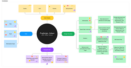
Our team used a mind map to prioritize key improvements:
-
Style & Visual Redesign – Enhancing design for better usability and engagement.
-
High-Priority Elements – Focusing on critical areas for improvement.
-
Other Enhancements – Refining functionality and user experience.

User Task Flow
Task flow visualization of the After Breast Cancer website redesign, highlighting key user interactions

Sketches
Early-stage sketches exploring potential layouts to guide the development of mockups for the After Breast Cancer redesign.


Mid-Fidelity Wireframes
Mid-fidelity wireframes with partially developed content, visual elements, and layout structure, bridging the gap between low-fidelity sketches and high-fidelity designs.


Wireflow Wireframes
Wireflow wireframes showcasing user navigation and interactions within the redesigned After Breast Cancer website.

A&B Testing
Tested variations for color contrast, readability, and user color preference, where three users voted on the most effective and visually appealing design.

Style Guide
Our design for After Breast Cancer prioritizes support, resilience, and empowerment, featuring:
-
Minimalist design for ease of use.
-
Soft, warm colors to evoke trust and compassion.
-
Refined logo for clarity and mission alignment.
-
Community-focused visuals to foster connection.
-
Inclusive, accessible UI for diverse users.

User Testing
Adjusting typography and contrast increased readability by 20%, based on accessibility standards, ensuring a more inclusive experience for all users.
Our redesign streamlined the booking process, reducing the time it takes users to complete an appointment request by 15 seconds, improving efficiency and user experience.
Final Thoughts
Challenges
-
Time Constraints: Limited time impacted the depth of research and iteration.
-
A/B Testing Limitations: We were only able to test the mobile prototype, missing desktop user insights.
-
Figma Learning Curve: Required ongoing research to execute certain design functions.
-
Balancing Accessibility & Aesthetics: Ensuring a visually appealing design while maintaining WCAG accessibility standards.
Key Learnings
-
Collaboration & Adaptability: Utilized individual strengths to drive the redesign.
-
User-Centered Thinking: Testing and interview insights guided design choices.
-
Value of Iteration: Small changes, like color contrast and navigation tweaks, greatly improved usability.
-
Clear Messaging: Users appreciated immediate visibility of the organization’s mission and purpose.
Next Steps
-
Incorporate Founder Feedback: Implement design improvements based on insights from our meeting with the ABC founder.
-
Refine & Iterate: Make necessary adjustments to enhance usability, accessibility, and overall user experience.
-
Present & Pitch: Showcase the improved design to the ABC team to assess potential implementation.
-
Conduct Additional User Testing: Gather feedback from a broader audience, including survivors and donors, to validate design decisions.


_edited.png)

